Data
We load the packages we will use:
We create an example dataset:
# Creation of dataset
Merkel <- data.frame(
  id=c(1:56),
  type = sample((rep(c("laMCC", "metMCC"), times =28))),
  response = c(30, sort(runif(n=53,min=-10,max=19), decreasing=TRUE),-25,-31),
  dose= sample(rep(c(80, 150), 28)))

# let's assign Best Overall Response (BOR)
Merkel$BOR= (c("PD", rep(c("SD"), times =54),"PR"))
Merkel format:
A data frame with 56 observations on the following 5 variables:
id ID of every subject
type MCC type
response Treatment response
dose
Treatment dose
BOR Best Overall Response
| id | type | response | dose | BOR |
|---|---|---|---|---|
| 1 | metMCC | 30.00000 | 80 | PD |
| 2 | metMCC | 17.46937 | 150 | SD |
| 3 | metMCC | 17.00505 | 150 | SD |
| 4 | metMCC | 16.97437 | 80 | SD |
| 5 | metMCC | 16.85078 | 80 | SD |
| 6 | metMCC | 16.73347 | 80 | SD |
| 7 | laMCC | 16.54156 | 150 | SD |
| 8 | laMCC | 16.44218 | 80 | SD |
Basic waterfall plot
barplot(Merkel$response,
        col="coral",
        border="coral",
        space=0.5, ylim=c(-50,50),
        main = "Waterfall plot for Target Lesion Tumor Size",
        ylab="Percentage change from baseline",
        cex.axis=1, cex.lab=1)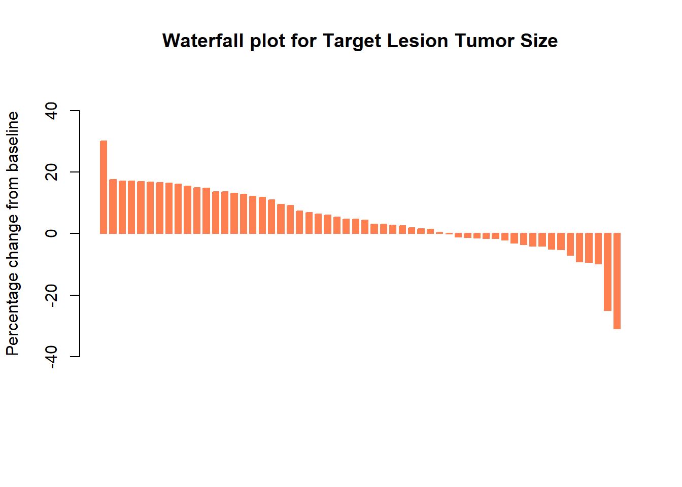
Add color by dose
col <- ifelse(Merkel$dose == 80,
              "cornflowerblue", # if dose = 80 mg
              "salmon") # if dose != 80 mg

barplot(Merkel$response,
        col=col,
        border=col,
        space=0.5,
        ylim=c(-50,50),
        main = "Waterfall plot for Target Lesion Tumor Size",
        ylab="Percentage change from baseline",
        cex.axis=1,
        legend.text= c( "80 mg", "150 mg"),
        args.legend=list(title="Treatment Dose", fill=c("cornflowerblue", "salmon"), border=NA, cex=1))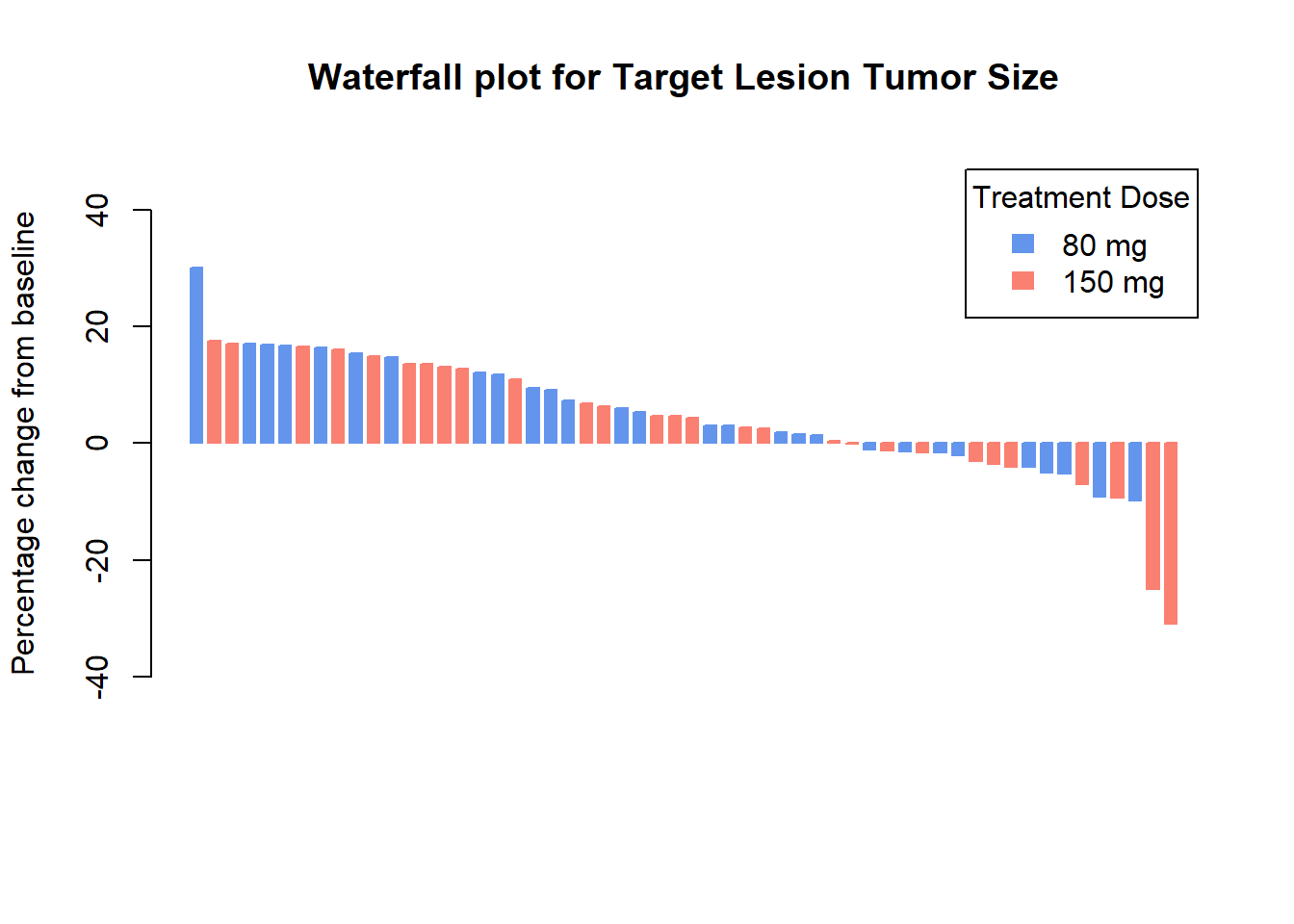
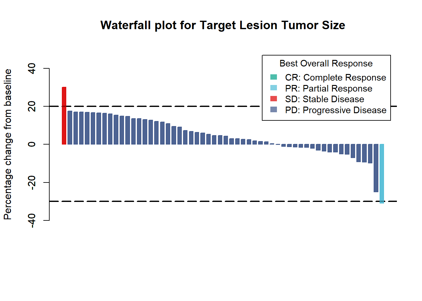
Add color by best overall response
col <- ifelse(Merkel$BOR == "CR",
              "#00A087B2",
              ifelse(Merkel$BOR == "PR",
                     "#4DBBD5B2",
                     ifelse(Merkel$BOR == "PD",
                            "#DC0000B2",
                            ifelse(Merkel$BOR == "SD",
                                   "#3C5488B2",
                                   "")
                            )))

barplot(Merkel$response,
        col=col,
        border=col,
        space=0.5,
        ylim=c(-50,50),
        main = "Waterfall plot for Target Lesion Tumor Size",
        ylab="Percentage change from baseline",
        cex.axis=.8,
        legend.text= c( "CR: Complete Response", "PR: Partial Response", "SD: Stable Disease", "PD: Progressive Disease"),
        args.legend=list(title="Best Overall Response", fill=c("#00A087B2","#4DBBD5B2",  "#DC0000B2", "#3C5488B2"), border=NA, cex=.9))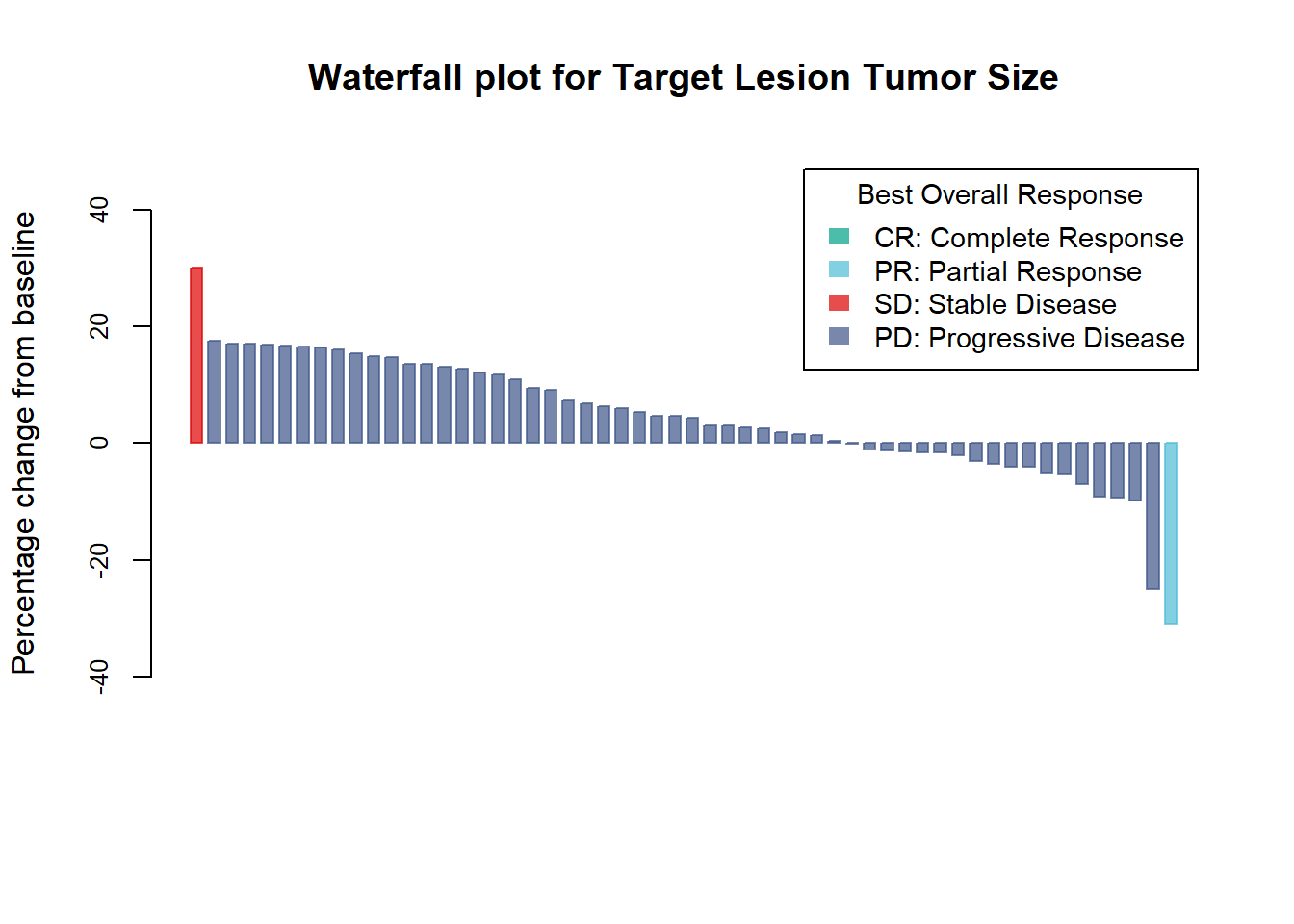
Add horizontal lines at 20% and -30%
barplot(Merkel$response,
        col=col,
        border=col,
        space=0.5,
        ylim=c(-50,50),
        main = "Waterfall plot for Target Lesion Tumor Size",
        ylab="Percentage change from baseline",
        cex.axis=1,
        legend.text= c( "CR: Complete Response", "PR: Partial Response", "SD: Stable Disease", "PD: Progressive Disease"),
        args.legend=list(title="Best Overall Response", fill=c("#00A087B2","#4DBBD5B2",  "#DC0000B2", "#3C5488B2"), border=NA, cex=.9))

abline(h=20, lty=5, lwd=2) #lty : line type ; lwd : line width
abline(h=-30, lty=5, lwd=2)

barplot(Merkel$response,
        col=col,
        border=col,
        space=0.5,
        ylim=c(-50,50),
        main = "Waterfall plot for Target Lesion Tumor Size",
        ylab="Percentage change from baseline",
        cex.axis=1,
        legend.text= c( "CR: Complete Response", "PR: Partial Response", "SD: Stable Disease", "PD: Progressive Disease"),
        args.legend=list(title="Best Overall Response", fill=c("#00A087B2","#4DBBD5B2",  "#DC0000B2", "#3C5488B2"), border=NA, cex=.9),
        add=TRUE) # Add = TRUE to draw line behind bars and legend