A density plot is a representation of the distribution of a numeric
variable. It is a smoothed version of the histogram and is used in the
same kind of situation.
Here is a basic example of a density plot with a mean line.
# Library
library(ggplot2)

# Dataset
set.seed(14012021)
x <- rnorm(200, mean=4)
df <- data.frame(x)

# Add mean line
p <- ggplot(df, aes(x=x)) +
  geom_density() +
  theme_bw()

p + geom_vline(aes(xintercept = mean(x)),
               color = "blue", linetype="dashed", size=1.5)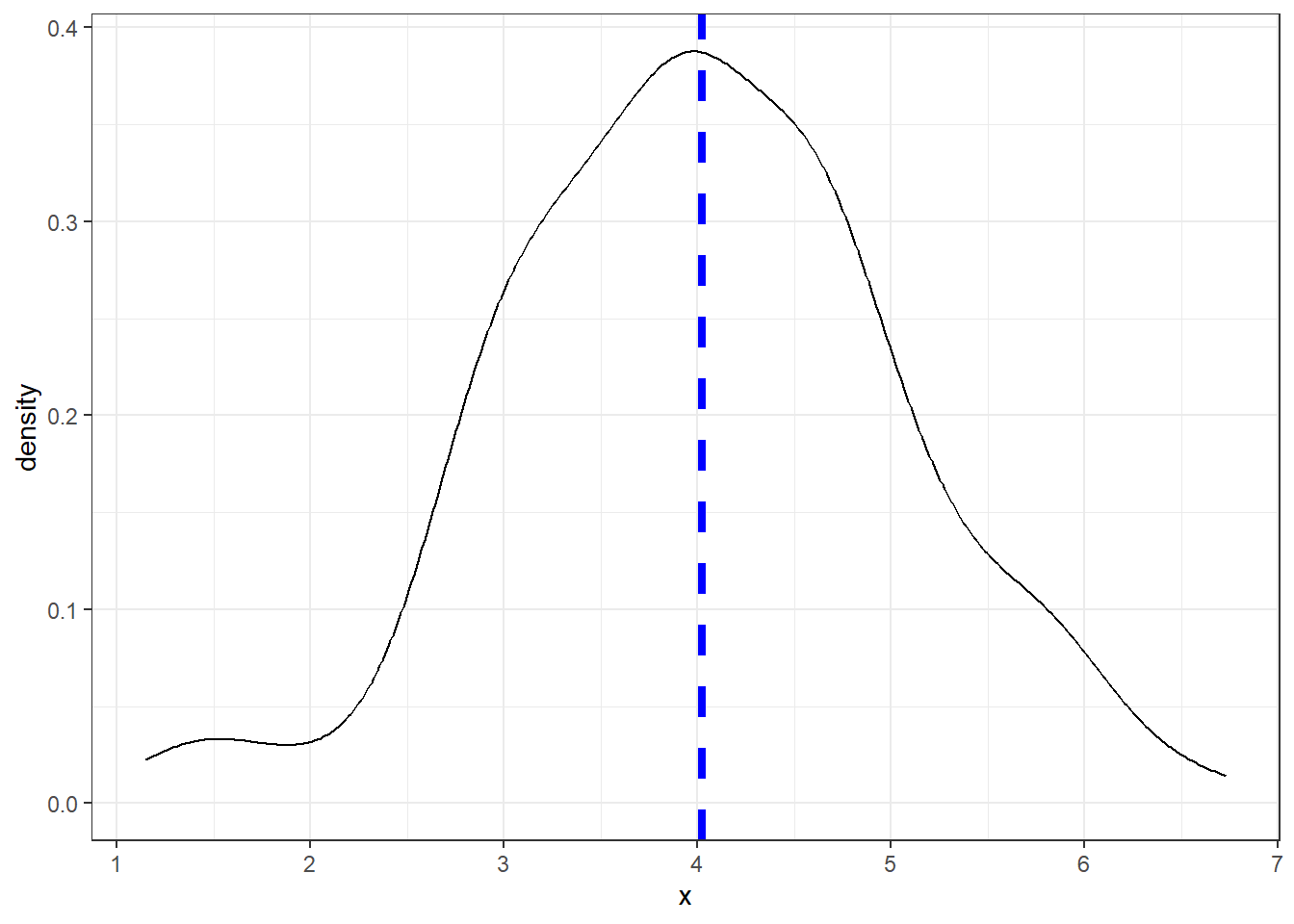
Contact
This document is a work of the statistics team in the Biostatistics and Medical Information Department at Saint-Louis Hospital in Paris (SBIM).
Based on The R Graph Gallery by Yan Holtz.