Data
We load the packages we will use:
We use the data frame called lalonde from the package
cobalt and we estimate the weights:
# Data
data("lalonde")

data <- weightit(
    treat ~ age + educ + married + nodegree + race + re74 + re75,
    data = lalonde, estimand = "ATE", method = "ps"
    )
set.cobalt.options(binary = "std") # Setting the global binary option to "std"| treat | age | educ | race | married | nodegree | re74 | re75 | re78 |
|---|---|---|---|---|---|---|---|---|
| 1 | 37 | 11 | black | 1 | 1 | 0 | 0 | 9930.0460 |
| 1 | 22 | 9 | hispan | 0 | 1 | 0 | 0 | 3595.8940 |
| 1 | 30 | 12 | black | 0 | 0 | 0 | 0 | 24909.4500 |
| 1 | 27 | 11 | black | 0 | 1 | 0 | 0 | 7506.1460 |
| 1 | 33 | 8 | black | 0 | 1 | 0 | 0 | 289.7899 |
| 1 | 22 | 9 | black | 0 | 1 | 0 | 0 | 4056.4940 |
| 1 | 23 | 12 | black | 0 | 0 | 0 | 0 | 0.0000 |
| 1 | 32 | 11 | black | 0 | 1 | 0 | 0 | 8472.1580 |
love.plot function
love.plot(
x, Valid input to a call to
bal.tab() (the output of a preprocessing function)
stats, Which statistic(s) should be reported
abs", Whether to present the statistic in absolute value or
not
agg.fun", If balance is to be displayed across
clusters or imputations rather than within a single cluster or
imputation, which summarizing function (“mean”, “max”, or “range”) of
the balance statistics should be used
var.order, How
to order the variables in the plot
drop.missing,
Whether to drop rows for variables for which the statistic has a value
of NA
drop.distance, Whether to ignore
the distance measure in plotting
thresholds, An
optional value to be used as a threshold marker in the plot
line, Whether to display a line connecting the points for
each sample
stars, When mean differences are to be
displayed, which variable names should have a star next to them (“none”,
“std”, “raw”)
grid, Whether gridlines should be shown
on the plot
limits, The bounds for the x-axis of the
plot
colors, The colors of the points on the plot
shapes, The shapes of the points on the plot
alpha, The transparency of the point
size, The size of the points on the plot
wrap, The number of characters at which to wrap axis labels
to the next line
var.names, An optional object
providing alternate names for the variables in the plot
title, The title of the plot
sample.names, New names to be given to the samples
labels, Labels to give the plots when multiple
stats are requested
position, The
position of the legend
themes, An optional list of
theme objects to append to each individual plot
...
)
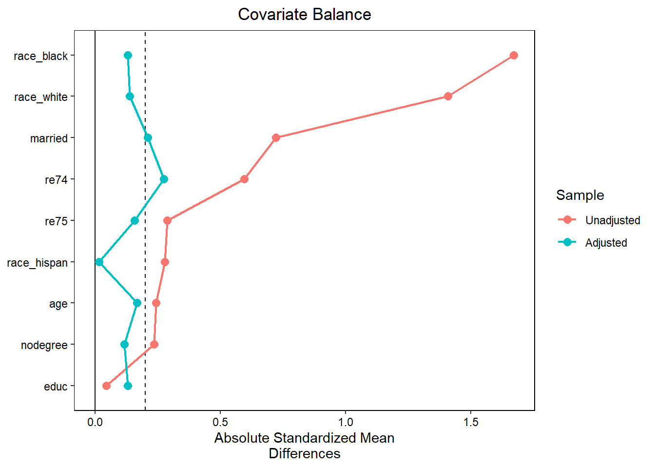
Love plot
# Advanced love plot
love.plot(data,
drop.distance = TRUE, # remove the propensity score
var.order = "unadjusted", # change the order of the covariates
abs = TRUE, # absolute mean difference
line = TRUE, # add lines between points
thresholds = c(m = .2)) # add a threshold at 0.2
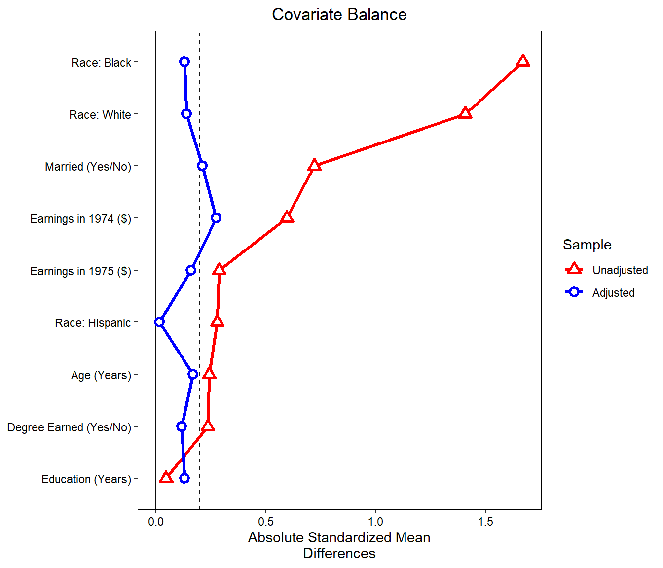
# changing variables names
new_names <- c(age = "Age (Years)",
educ = "Education (Years)",
married = "Married (Yes/No)",
nodegree = "Degree Earned (Yes/No)",
race_white = "Race: White",
race_black = "Race: Black",
race_hispan = "Race: Hispanic",
re74 = "Earnings in 1974 ($)",
re75 = "Earnings in 1975 ($)"
)
love.plot(data,
drop.distance = TRUE,
var.order = "unadjusted",
abs = TRUE,
line = TRUE,
thresholds = c(m = .2),
var.names = new_names, # change variables names
colors = c("red", "blue"), # change colors
shapes = c("triangle filled","circle filled"), # change shapes of points
size = 4) # change points size