We will here use the fill_survival_data function in the
Data
& Functions page.
Download
ggcompetingrisks1.R
# Function
fill_survival_data <- function(fit){
  base <- rbind(data.frame(time=0, surv=1), data.frame(time=fit$time, surv=fit$surv))
  base <- rbind(base %>% mutate(surv = lag(surv)) %>% na.omit(), base)
  return(base %>% arrange(time))
}

# Or you can source the ggcompetingrisks1.R file
# source("ggcompetingrisks1.R", encoding="latin1")


# Libraries
library(survminer)
library(survival)
library(tidyverse)
library(zoo)
library(conflicted)
conflict_prefer("filter", "dplyr")
conflict_prefer("select", "dplyr")
conflict_prefer("lag", "dplyr")


# Data
lung <- lung[,c("time","status","sex")]

# Fitting survival curves
fit.gp <- survfit(Surv(time, status) ~ sex, data = lung)

# Creation of an other data frame with the survival data
data_km <-  full_join(fill_survival_data(fit.gp[1]), fill_survival_data(fit.gp[2]), by="time", suffix = c("1", "2")) %>%
  arrange(time) %>%
  mutate(
    surv1:=na.locf(surv1),
    surv2:=na.locf(surv2))
Create the plot
# We set the xlim, break time
# PLOT

# We set the xlim, break time and palette
break.time.by <- 250
var_time <- "del"
xlim <- c(0, 1000)
palette <- scales::hue_pal()(2)

plot.OS <- ggsurvplot(
  fit.gp,
  xlab = "Time (months)", ylab="Survival probability",
  xlim=xlim, ylim=c(0, 1),
  lwd=0.5,
  break.time.by = break.time.by,
  title="", legend="top", legend.title="Legend title",
  legend.labs=c("Male", "Female"),
  palette=palette,
  conf.int = FALSE,
  pval=T, pval.size=4,
  ggtheme = theme_classic(),
  risk.table = T,
  # risk.table.col = "group",
  risk.table.y.text = TRUE,
  risk.table.y.text.col = TRUE,
  risk.table.fontsize=3,
  risk.table.show.legend = FALSE,
  tables.theme = theme_cleantable()
)

plot.all <- ggplot() +
  geom_step(data = ggplot_build(plot.OS$plot)$data[[1]], aes(x, y, color=factor(group))) + # surv data
  geom_point(data = ggplot_build(plot.OS$plot)$data[[3]], aes(x, y, color=factor(group)), shape=3) + # cens data
  geom_ribbon(data = data_km, mapping = aes(x=time, ymin=surv1, ymax=surv2), fill='black', alpha=.2) +
  theme_classic() +
  theme(legend.position="top") + labs(color="Legend title") +
  xlab("Time") + ylab("Survival probability") +
  ylim(0, 1) +
  coord_cartesian(xlim = xlim) +
  scale_x_continuous(breaks = seq(0, xlim[2], break.time.by)) +
  scale_color_discrete(labels = c("Male", "Female"))

ggarrange(plot.all, plot.OS$table, ncol = 1, nrow = 2, heights = c(0.85, 0.15), align = "v")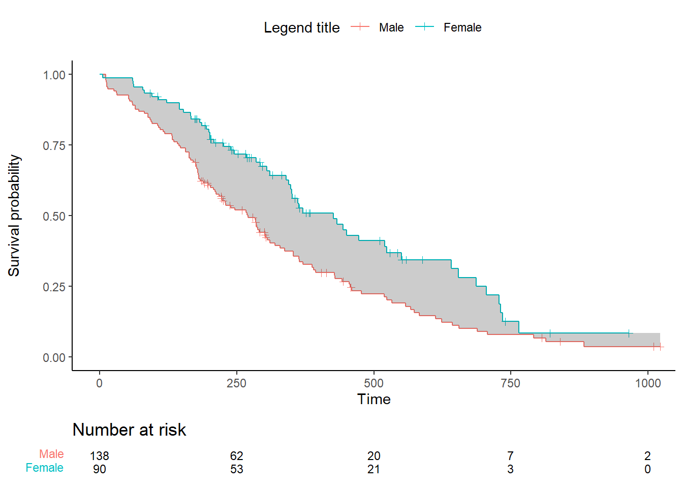
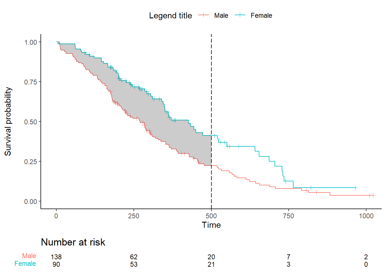
Add a cut-off :
time_max <- 500

data_km <- rbind(data_km %>% filter(time<=time_max), c(time_max, NA, NA)) %>%
  mutate(
    surv1=na.locf(surv1),
    surv2=na.locf(surv2))


plot.all <- ggplot() +
  geom_step(data = ggplot_build(plot.OS$plot)$data[[1]], aes(x, y, color=factor(group))) + # surv data
  geom_point(data = ggplot_build(plot.OS$plot)$data[[3]], aes(x, y, color=factor(group)), shape=3) + # cens data
  geom_ribbon(data = data_km %>% filter(time<=time_max), mapping = aes(x=time, ymin=surv1, ymax=surv2), fill='black', alpha=.2) +
  theme_classic() +
  theme(legend.position="top") + labs(color="Legend title") +
  xlab("Time") + ylab("Survival probability") +
  ylim(0, 1) +
  coord_cartesian(xlim = xlim) +
  scale_x_continuous(breaks = seq(0, xlim[2], break.time.by)) +
  scale_color_discrete(labels = c("Male", "Female")) +
  geom_vline(xintercept = time_max, linetype = "longdash", color = "black")

ggarrange(plot.all, plot.OS$table, ncol = 1, nrow = 2, heights = c(0.85, 0.15), align = "v")