Data
lung format:
A data frame with 228 observations on the following 10 variables :
time Survival time in days
status
Censoring status; 1=censored, 2=dead
Sex Patient sex;
Male=1 Female=2
| time | status | sex |
|---|---|---|
| 306 | 2 | 1 |
| 455 | 2 | 1 |
| 1010 | 1 | 1 |
| 210 | 2 | 1 |
| 883 | 2 | 1 |
| 1022 | 1 | 1 |
| 310 | 2 | 2 |
| 361 | 2 | 2 |
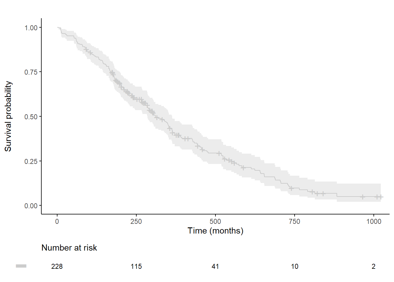
Customized survival curves
# We set the xlim, break time and palette
break.time.by <- 250
xlim <- c(0, 1000)
palette <- c("grey")

plot.OS <-ggsurvplot(
  fit,
  data = lung,
  xlab = "Time (months)", ylab="Survival probability",
  xlim=xlim, ylim=c(0, 1),
  lwd=0.5,
  break.time.by = break.time.by,
  title="", legend="none", legend.title="",
  palette=palette,
  conf.int = TRUE,
  conf.int.fill = palette,
  ggtheme = theme_classic(),
  risk.table = T,
  risk.table.y.text = FALSE,
  risk.table.y.text.col = TRUE,
  risk.table.fontsize=3,
  tables.theme = theme_cleantable()
  )

#  To customize risk table
plot.OS$table <- plot.OS$table +
  theme(plot.title = element_text(size = 11, color = "black", face = "plain" ))

ggarrange(plot.OS$plot, plot.OS$table, ncol = 1, nrow = 2, heights = c(0.85, 0.15), align = "v")
To change the axis origin: (0,0)
# We set the xlim, break time and palette
break.time.by <- 250
xlim <- c(0, 1000)
palette <- c("grey")

plot.OS <-ggsurvplot(
  fit,
  data = lung,
  xlab = "Time (months)", ylab="Survival probability",
  xlim=xlim, ylim=c(0, 1),
  lwd=0.5,
  break.time.by = break.time.by,
  title="", legend="none", legend.title="",
  palette=palette,
  conf.int = TRUE,
  conf.int.fill = palette,
  ggtheme = theme_classic(),
  risk.table = T,
  risk.table.y.text = FALSE,
  risk.table.y.text.col = TRUE,
  risk.table.fontsize=3,
  tables.theme = theme_cleantable()
  )

plot.OS$plot <- plot.OS$plot + scale_x_continuous(expand = c(0, 0, .05, 0)) +
  scale_y_continuous(expand = c(0, 0, .05, 0))

# to custemize risk table
plot.OS$table <- plot.OS$table +
  theme(plot.title = element_text(size = 10, color = "black", face = "plain")) +
  scale_x_continuous(expand = c(0, 0, .05, 0)) +
  coord_cartesian(xlim=c(-5, 1000), clip = "off") # allows you to exit the frame with clip=off

ggarrange(plot.OS$plot, plot.OS$table, ncol = 1, nrow = 2, heights = c(0.85, 0.15), align = "v")