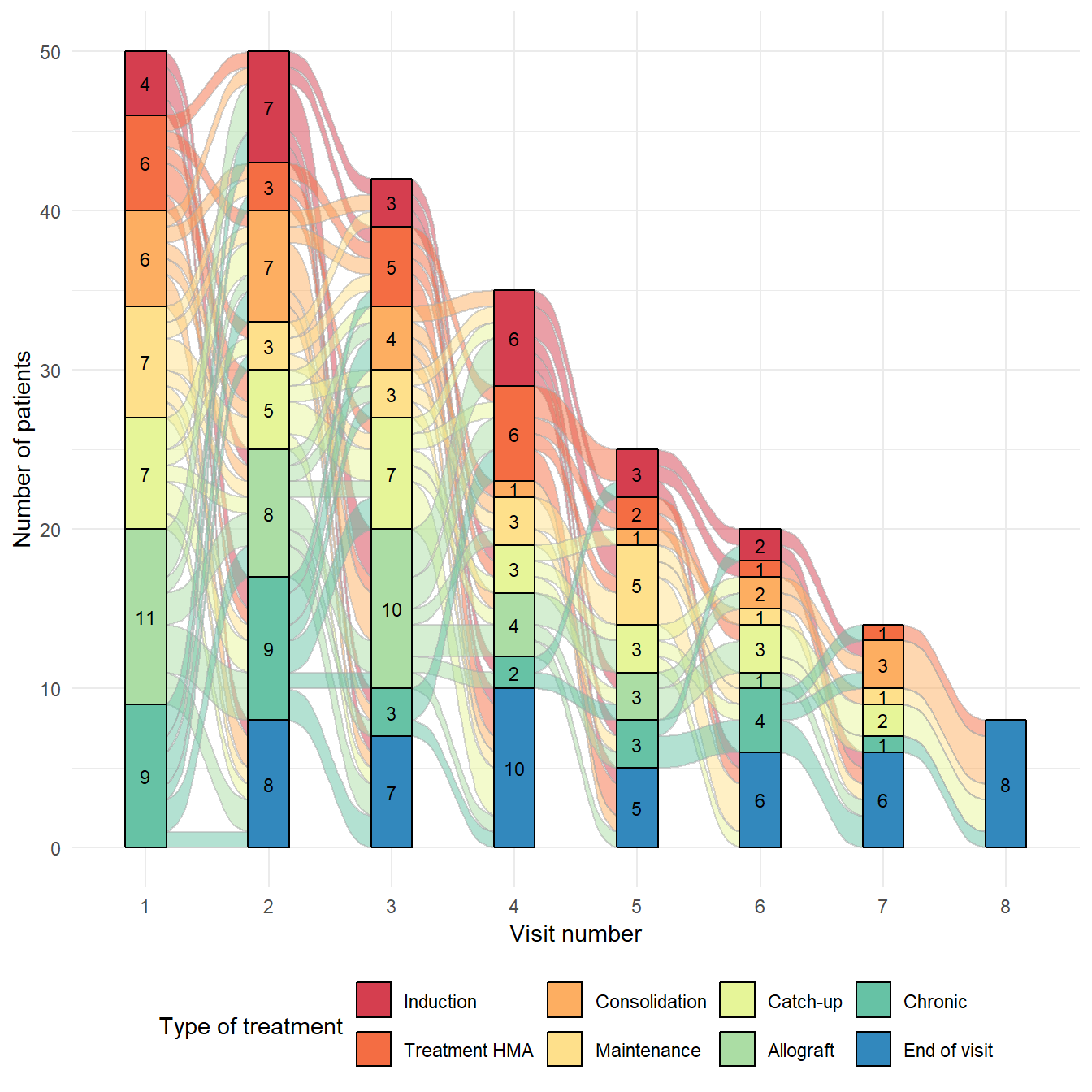
Basic alluvial diagram
Basic alluvial diagrams are built using the geom_flow
and geom_stratum functions from the ggalluvial
package:
geom_flowreceives a dataset of the horizontal and vertical positions of the lodes of an alluvial plot, the intersections of the alluvia with the strata. It reconfigures these into alluvial segments connecting pairs of corresponding lodes in adjacent strata and plots filled x-splines between each such pair, using a provided knot position parameter, and filled rectangles at either end, using a provided width.geom_stratumreceives a dataset of the horizontal and vertical positions of the strata of an alluvial plot. It plots rectangles for these strata of a provided width.
# Libraries
library(ggplot2)
library(dplyr)
library(ggalluvial)


# Creation of dataset
set.seed(123)
data <- data.frame(
  ID = rep(1:50, times=sample(1:7, size=50, replace=T))
)

TYPCURE <- c("Induction", "Treatment HMA", "Consolidation", "Maintenance", "Catch-up", "Allograft", "Chronic")
data$TYPCURE <- sample(TYPCURE, size=nrow(data), replace=T)
data <- rbind(data, data.frame(ID = 1:50, TYPCURE = "End of visit"))
data$TYPCURE <- factor(data$TYPCURE, levels=c(TYPCURE,"End of visit"))[drop=T]

data <- data %>% group_by(ID) %>%
  mutate(NVIS = 1:n(), NTOTVIS = n()) %>%
  arrange(ID, NVIS) %>% data.frame()
data$NVIS <- as.character(data$NVIS)

# Alluvial diagram
p <- ggplot(data, aes(x = NVIS, stratum = TYPCURE, alluvium = ID,
                      fill = TYPCURE, label = TYPCURE)) +
  geom_flow(color = "darkgray") +
  geom_stratum() +
  scale_fill_brewer(type = "qual", palette = "Spectral") +
  labs(x = "Visit number",
       y = 'Number of patients',
       fill = "Type of treatment") +
  theme_minimal() +
  theme(legend.position = "bottom") +
  # add number of patients
  geom_text(stat = "stratum", aes(label = round(after_stat(count), 3)), size=3)
Alluvial diagram with geom_bar and
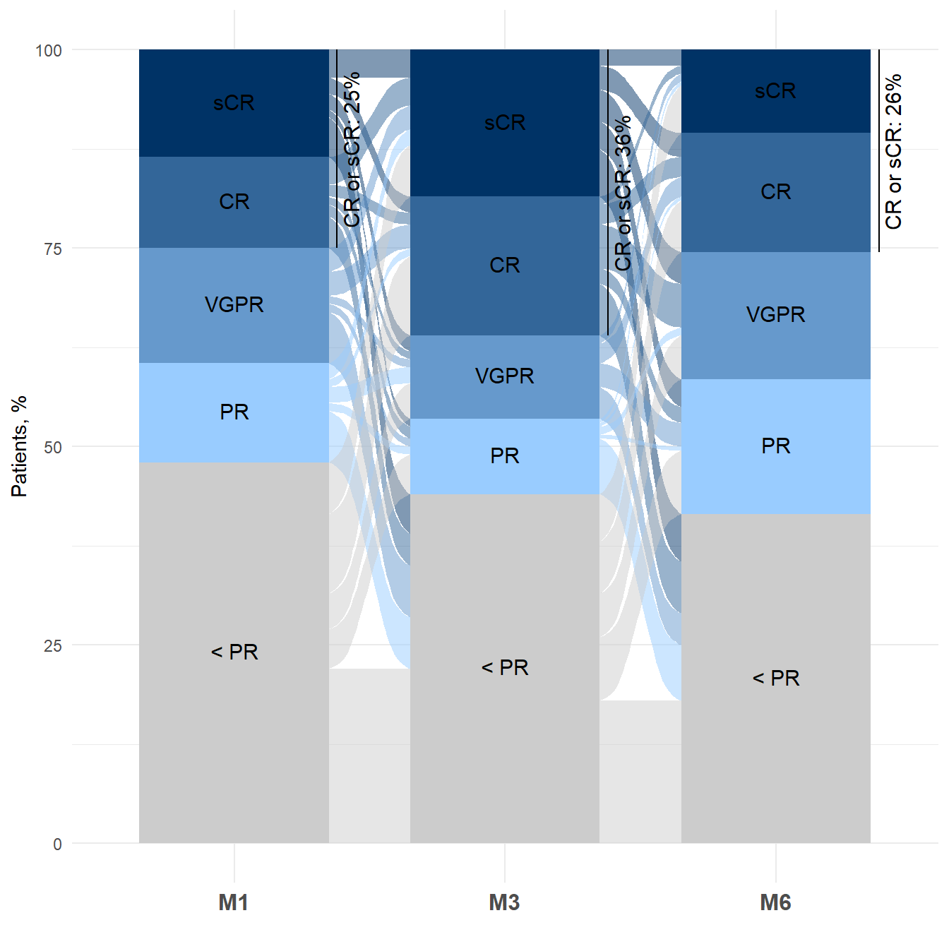
geom_flow
Here another example of alluvial diagram, after building a basic
barplot with geom_bar.
# Libraries
library(ggplot2)
library(dplyr)
library(tidyr)
library(ggalluvial)


# Creation of dataset
set.seed(123)
data <- data.frame(
  RESP_M1 = sample(c('sCR', 'CR', 'VGPR', 'PR', 'MR', 'SD', 'PD'), size=200, replace=T),
  RESP_M3 = sample(c('sCR', 'CR', 'VGPR', 'PR', 'MR', 'SD', 'PD'), size=200, replace=T),
  RESP_M6 = sample(c('sCR', 'CR', 'VGPR', 'PR', 'MR', 'SD', 'PD'), size=200, replace=T)
)

# for barplot
dataPLOT <- data %>%
  pivot_longer(cols = everything(),
               names_to = c(".value","PERIOD"),
               names_sep = "_") %>% data.frame()
dataPLOT$RESP[dataPLOT$RESP %in% c('MR','SD','PD')] <- "< PR"
dataPLOT$RESP <- factor(dataPLOT$RESP, levels=c('sCR','CR','VGPR','PR','< PR'))[drop=TRUE]

dataPLOT <- dataPLOT %>%
  group_by(PERIOD, RESP) %>%
  summarise(count = n()) %>%
  ungroup %>% group_by(PERIOD) %>%
  mutate(percent = count/sum(count)*100,
         countCR = sum(count[RESP%in%c('sCR','CR')]),
         percentCR = countCR/sum(count)*100,
         y = sum(count[RESP%in%c('PR','VGPR','< PR')])/sum(count)*100) %>%
  data.frame()

dataPLOT$percentCR_lab <- paste0('CR or sCR: ',round(dataPLOT$percentCR,0),'%')
dataPLOT$y_lab <- dataPLOT$y + dataPLOT$percentCR/2

# for flows
dataFLOW <- data
dataFLOW$RESP_M1[dataFLOW$RESP_M1 %in% c('MR','SD','PD')] <- "< PR"
dataFLOW$RESP_M1 <- factor(dataFLOW$RESP_M1, levels=c('sCR','CR','VGPR','PR','< PR'))[drop=TRUE]
dataFLOW$RESP_M3[dataFLOW$RESP_M3 %in% c('MR','SD','PD')] <- "< PR"
dataFLOW$RESP_M3 <- factor(dataFLOW$RESP_M3, levels=c('sCR','CR','VGPR','PR','< PR'))[drop=TRUE]
dataFLOW$RESP_M6[dataFLOW$RESP_M6 %in% c('MR','SD','PD')] <- "< PR"
dataFLOW$RESP_M6 <- factor(dataFLOW$RESP_M6, levels=c('sCR','CR','VGPR','PR','< PR'))[drop=TRUE]

dataFLOW <- dataFLOW %>% count(RESP_M1, RESP_M3, RESP_M6) %>%
  mutate(ID = row_number()) %>%
  pivot_longer(cols = c(RESP_M1, RESP_M3, RESP_M6),
               names_to = "PERIOD",
               values_to = "RESP") %>% data.frame()
dataFLOW$PERIOD <- factor(dataFLOW$PERIOD, c('RESP_M1','RESP_M3','RESP_M6'), c('M1','M3','M6'))
dataFLOW$percent <- dataFLOW$n/nrow(data)*100


# Alluvial diagram
p <- ggplot(dataPLOT, aes(x=PERIOD, y=percent, fill=RESP)) +
  geom_bar(stat = 'identity', width = 0.7)  +
  geom_flow(data=dataFLOW,
            aes(x = PERIOD, y = percent, stratum = RESP, alluvium = ID,
                fill = RESP, label = RESP), inherit.aes = FALSE, width=0.7) +
  geom_bar(stat = 'identity', width = 0.7) +
  scale_fill_manual(values = c("#003366", "#336699", "#6699CC", "#99CCFF","#CCCCCC")) +
  labs(x = '', y = 'Patients, %', fill = '') +
  theme_minimal() +
  theme(legend.position = "none", axis.text.x = element_text(size = 12, face = 'bold')) +
  # legend in barplot
  ggtext::geom_richtext(aes(label = RESP),
                        position = position_stack(vjust = 0.5),
                        size = 4, color = 'black', label.color = NA) +
  # lengend CR/sCR
  geom_text(data = dataPLOT %>% group_by(PERIOD) %>% filter(row_number()==1),
            aes(x = PERIOD, y = y_lab, label = percentCR_lab),
            position = position_nudge(x = 0.43),
            angle=90, size = 4, color = 'black') +
  geom_segment(data = dataPLOT %>% group_by(PERIOD) %>% filter(row_number()==1),
               aes(x = PERIOD, xend = PERIOD, y = y, yend = y + percentCR),
               position = position_nudge(x = 0.38))