We will here use the ggplot2 package and the dataset
created in the Data &
Functions page.
# Libraries
library(tidyverse)
library(ggplot2)
# Creation of dataset
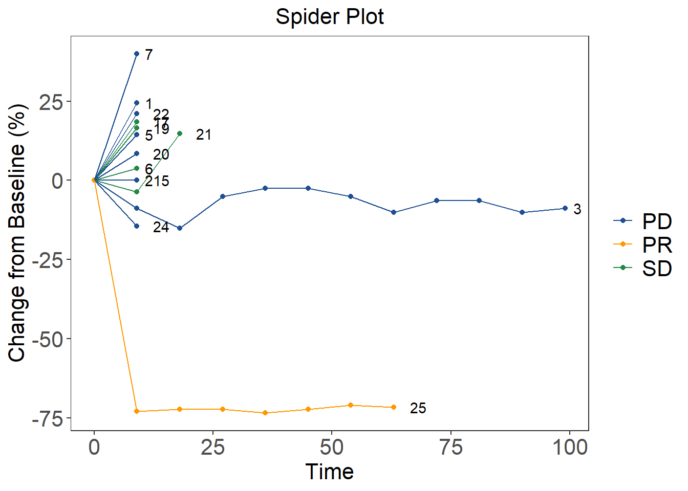
data <- data.frame(
c(1,1,2,2,3,3,3,3,3,3,3,3,3,3,3,3,5,5,6,6,7,7,15,15,17,17,19,19,20,20,21,21,21,22,22,24,24,25,25,25,25,25,25,25,25),
c(45,56,28,28,79,72,67,75,77,77,75,71,74,74,71,72,69,79,27,28,15,21,43,43,27,32,32.6,38,131,142,27,26,31,90,109,83,71,166,45,46,46,44,46,48,47),
c("PD","PD","PD","PD","PD","PD","PD","PD","PD","PD","PD","PD","PD","PD","PD","PD","PD","PD","SD","SD","PD","PD","PD","PD","SD","SD","SD","SD","PD","PD","SD","SD","SD","PD","PD","PD","PD","PR","PR","PR","PR","PR","PR","PR","PR"),
c(0,0,1,1,1,1,1,1,1,1,1,1,1,1,1,1,1,1,0,0,1,1,1,1,0,0,0,0,1,1,0,0,0,0,0,1,1,0,0,0,0,0,0,0,0),
c(0,9,0,9,0,9,18,27,36,45,54,63,72,81,90,99,0,9,0,9,0,9,0,9,0,9,0,9,0,9,0,9,18,0,9,0,9,0,9,18,27,36,45,54,63)
)
colnames(data) <- c("ID","sum","RECIST","lesion","week")
# add change from baseline variable
data1 <- data %>%
group_by(ID) %>%
arrange(ID, week) %>%
mutate(changebsl = 100*(sum - first(sum))/(first(sum))) %>%
ungroup() %>%
mutate(changebsl = replace(changebsl, changebsl == "NaN", 0)) spider_plot <- ggplot(data1) +
#build the basic graph
geom_point(aes(x=week, y=changebsl, group=ID, colour=RECIST)) +
geom_line(aes(x=week, y=changebsl, group=ID, colour=RECIST)) +
#color
scale_color_manual(values=c("#1d4f91", "#FF9800", "#228848", '#AE2573', '#D14124')) +
#axis and title
labs(x = "Time",
y = "Change from Baseline (%)",
title = "Spider Plot",
shape = " ",
color = " ") +
theme_minimal()+
theme_bw()+
#font size and background
guides(fill=guide_legend(title=" "))+
theme(panel.grid.minor = element_blank(),
panel.grid.major = element_blank(),
panel.background = element_blank(),
plot.title = element_text(hjust = 0.5, size = 16),
axis.text=element_text(size=16),
axis.title=element_text(size=16),
legend.text = element_text(size=16))
# Show ID
data_id <- data1 %>%
group_by(ID) %>%
filter(week == max(week))
spider_plot +
geom_text(data = data_id, aes(x=week, y=changebsl, label=paste(data_id$ID), hjust=-1))