Data
Interval plot using ggplot2 package
Here, we will be using the geom_point() function to plot
the points and then the geom_errorbar() function to add the
confidence intervals to the plot.
# Libraries
library(ggplot2)

min_y <- floor(min(data$lower[data$group=='A'],na.rm=T))
max_y <- ceiling(max(data$upper[data$group=='A'],na.rm=T))

figure <- ggplot(data[data$group=='A',], aes(visit, value)) +
  geom_point(color="#0099B4FF") +
  geom_line(size=0.5, color="#0099B4FF") +
  geom_errorbar(aes(ymin = lower, ymax = upper), size=0.5, width=0.3, color="#0099B4FF") +
  labs(x = "Time (months)") +
  scale_x_continuous(breaks = seq(0, max(data$visit), 1)) +
  scale_y_continuous(breaks = seq(min_y, max_y, 5), limits = c(min_y, max_y)) +
  scale_color_manual(values=c("#69b3a2", "#404080")) +
  theme_classic() +
  theme(axis.title = element_text(size=9),
        legend.position = "top")

table <- ggplot(data[data$group=='A',], aes(x = visit, y = factor(1), label = n)) +
  geom_text(cex=3) +
  theme(
    panel.grid.major = element_blank(),
    plot.background = element_blank(),
    panel.grid.minor = element_blank(),
    panel.border = element_blank(),
    legend.position = "none",
    axis.line = element_blank(),
    axis.text.x = element_blank(),
    axis.text.y = element_blank(),
    axis.ticks = element_blank(),
    axis.ticks.x = element_blank(),
    axis.title.x = element_blank(),
    axis.title.y = element_text(size = 10),
    plot.title = element_blank(),
    panel.background = element_rect("white")
  ) +
  scale_x_continuous(breaks = seq(0, max(data$visit), 1),
                     expand = c(0.07,-0.07)) +
  scale_y_discrete(name = "Number \n of patients")

ggpubr::ggarrange(figure, table, nrow=2, heights=c(0.8, 0.15), align = "v")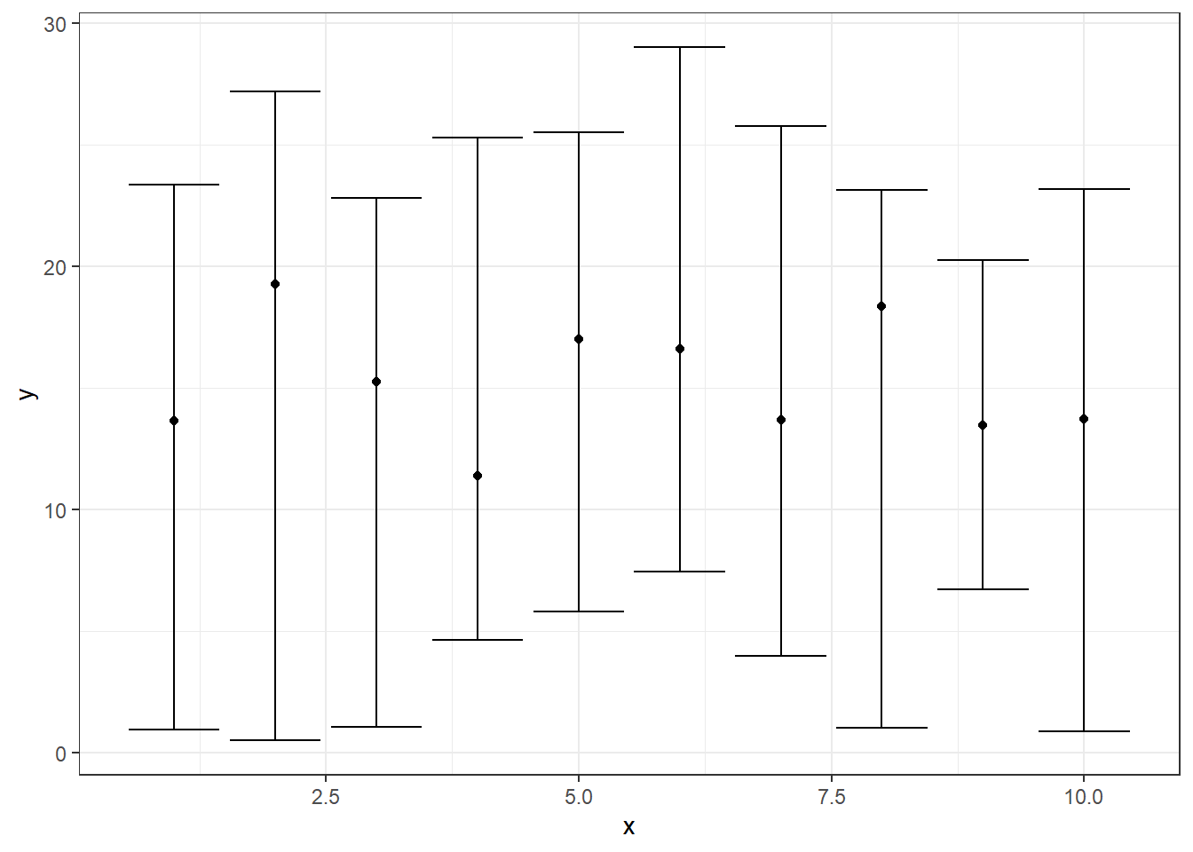
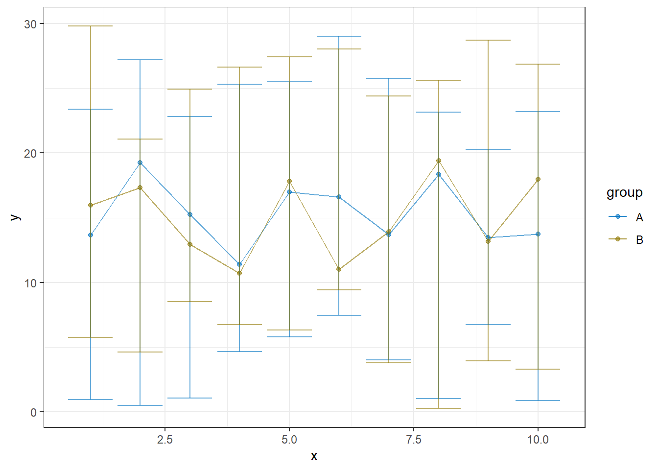
We add a parameter to see the dotplot for the groups A and B simultaneously.
min_y <- floor(min(data$lower,na.rm=T))
max_y <- ceiling(max(data$upper,na.rm=T))

figure <- ggplot(data, aes(visit, value, col=group)) +
  geom_point() +
  geom_line(size=0.5) +
  geom_errorbar(aes(ymin = lower, ymax = upper), size=0.5, width=0.3) +
  labs(x = "", col="Arm") +
  scale_x_continuous(breaks = seq(1, max(data$visit), 1),
                     labels = paste("Visit",1:10)) +
  scale_y_continuous(breaks = seq(min_y, max_y, 5), limits = c(min_y, max_y)) +
  scale_color_manual(values=c("#69b3a2", "#404080")) +
  theme_classic() +
  theme(axis.title = element_text(size=9),
        legend.position = "top")

# reverse the order of the labels to get the right order in the table :
data$group_rev <- factor(data$group, levels=c('B','A'))
table <- ggplot(data, aes(x = visit, y = group_rev, label = n)) +
  geom_text(cex=3, check_overlap = TRUE) +
  theme(
    panel.grid.major = element_blank(),
    plot.background = element_blank(),
    panel.grid.minor = element_blank(),
    panel.border = element_blank(),
    legend.position = "none",
    axis.line = element_blank(),
    axis.text.x = element_blank(),
    axis.ticks = element_blank(),
    axis.ticks.x = element_blank(),
    axis.title.x = element_blank(),
    axis.title.y = element_text(size = 10),
    plot.title = element_blank(),
    panel.background = element_rect("white")
  ) +
  scale_x_continuous(breaks = seq(1, max(data$visit), 1),
                     labels = paste("Visit",1:10),
                     expand = c(0.07,-0.07)) +
  scale_y_discrete(name = "Number \n of patients")

ggpubr::ggarrange(figure, table, nrow=2, heights=c(0.8, 0.15), align = "v")