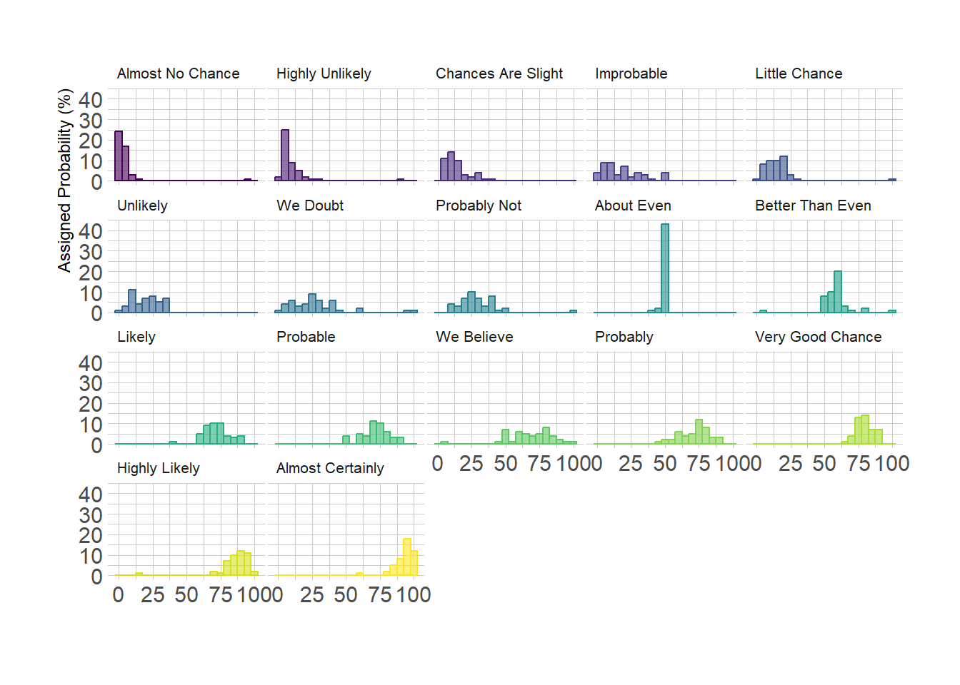
If the number of group you need to represent is high, drawing them on
the same axis often results in a cluttered and unreadable figure. A good
workaroung is to use small multiple where each group is represented in a
fraction of the plot window, making the figure easy to read. This is
pretty easy to build thanks to the facet_wrap()function of
ggplot2.
# Libraries
library(tidyverse)
library(hrbrthemes)
library(viridis)
library(forcats)

# Load data from github
data <- read.table("https://raw.githubusercontent.com/zonination/perceptions/master/probly.csv", header=TRUE, sep=",")
data <- data %>%
  gather(key="text", value="value") %>%
  mutate(text = gsub("\\.", " ",text)) %>%
  mutate(value = round(as.numeric(value),0))

# Histogram with several groups
data %>%
  mutate(text = fct_reorder(text, value)) %>%
  ggplot( aes(x=value, color=text, fill=text)) +
    geom_histogram(alpha=0.6, binwidth = 5) +
    scale_fill_viridis(discrete=TRUE) +
    scale_color_viridis(discrete=TRUE) +
    theme_ipsum() +
    theme(
      legend.position="none",
      panel.spacing = unit(0.1, "lines"),
      strip.text.x = element_text(size = 8)
    ) +
    xlab("") +
    ylab("Assigned Probability (%)") +
    facet_wrap(~text)