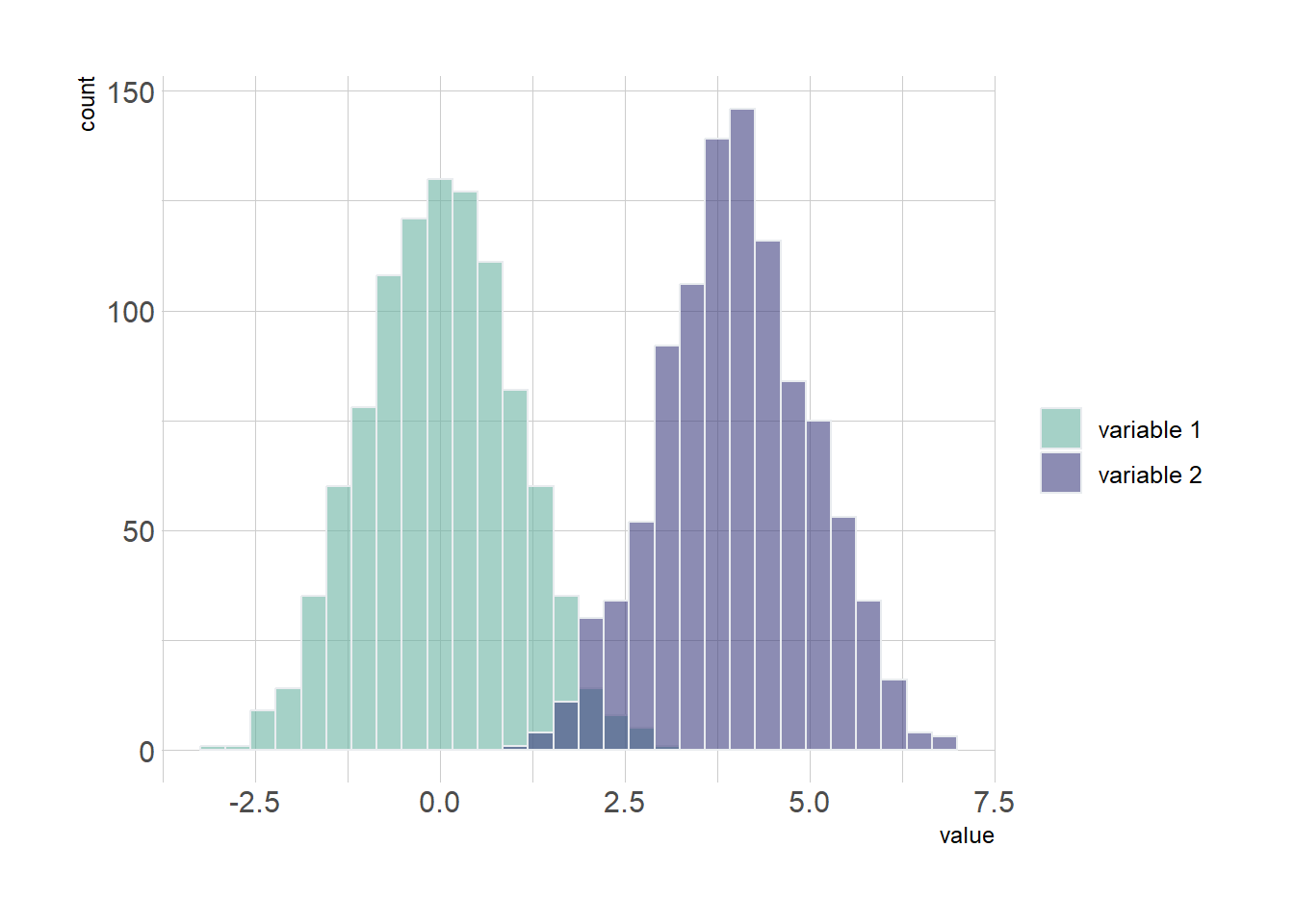
If the number of group or variable you have is relatively low, you can display all of them on the same axis, using a bit of transparency to make sure you do not hide any data.
# Libraries
library(ggplot2)
library(dplyr)
library(hrbrthemes) # library for themes

# Creation of dataset
data <- data.frame(
  type = c( rep("variable 1", 1000), rep("variable 2", 1000) ),
  value = c( rnorm(1000), rnorm(1000, mean=4) )
)

# Multi histogram
data %>%
  ggplot(aes(x=value, fill=type)) +
    geom_histogram( color="#e9ecef", alpha=0.6, position = 'identity') +
    scale_fill_manual(values=c("#69b3a2", "#404080")) +
    theme_ipsum() +
    labs(fill="")