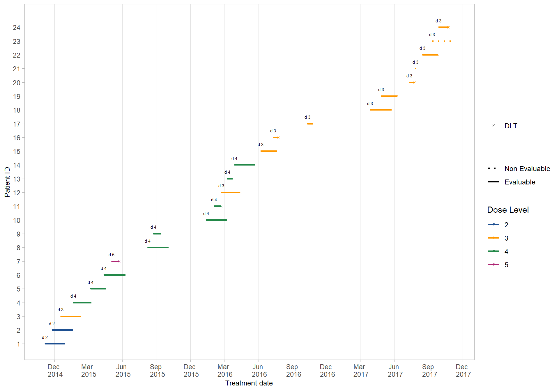
Data
We build the following dataset:
# Libraries
library(ggplot2)

# Creation of dataset
data <- data.frame(
  Evaluable=c(1,1,1,1,1,1,1,1,1,1,1,1,1,1,1,1,1,1,1,1,1,1,0,1),
  Therapy_Start_Date=c("2014-11-05", "2014-11-24", "2014-12-17", "2015-01-21", "2015-03-08",
                       "2015-04-12", "2015-05-03", "2015-08-08", "2015-08-24", "2016-01-12",
                       "2016-02-02", "2016-02-22", "2016-03-09", "2016-03-28", "2016-06-06",
                       "2016-07-10", "2016-10-10", "2017-03-27", "2017-04-26", "2017-07-11",
                       "2017-07-27", "2017-08-15", "2017-09-10", "2017-09-27"),
  Dose_Level=c("2", "2", "3", "4", "4", "4", "5", "4", "4", "4", "4", "3",
               "4", "4", "3", "3", "3", "3", "3", "3", "3", "3", "3", "3"),
  Last_Assessment_Date=c("2014-12-29", "2015-01-19", "2015-02-10", "2015-03-10", "2015-04-19",
                         "2015-06-10", "2015-05-24", "2015-10-03", "2015-09-14", "2016-03-08",
                         "2016-02-21", "2016-04-12", "2016-03-23", "2016-05-23", "2016-07-21",
                         "2016-07-25", "2016-10-24", "2017-05-24", "2017-06-07", "2017-07-25",
                         "2017-07-27", "2017-09-25", "2017-11-07", "2017-10-24"),
  DLT=c("0", "0", "0", "0", "0", "0", "1", "0", "0", "0", "1", "1",
        "0", "0", "0", "1", "0", "0", "1", "1", "0", "1", "0", "1")
)

data$Dose_Level <- factor(data$Dose_Level, c(2, 3, 4, 5))
data$Therapy_Start_Date <- as.Date(data$Therapy_Start_Date)
data$Last_Assessment_Date <- as.Date(data$Last_Assessment_Date)
data <- data[order(data[, "Therapy_Start_Date"]), ]
data$ID <- 1:nrow(data)
data format:
A data frame with 24 observations on the following 6 variables:
ID A distinct number or character for each patient. ID
order should correspond to the entry time of the patient. Start from 1
to the last patient
Evaluable The evaluable variable
should indicate whether or not the patient is evaluable in the trial. It
should be 0 or 1 (1 = Evaluable) for each entry
Therapy_Start_Date This variable gives the start date of
treatment
Dose_Level The dose level variable can be a
numeric or character variable indicating the dose level each patient has
been assigned
Last_Assessment_Date This variable gives
the last date of treatment
DLT The toxicity variable
should indicate whether or not a patient experienced a dose-limiting
toxicity (DLT). It should be 0 or 1 (1 = DLT) for each entry
| Evaluable | Therapy_Start_Date | Dose_Level | Last_Assessment_Date | DLT | ID |
|---|---|---|---|---|---|
| 1 | 2014-11-05 | 2 | 2014-12-29 | 0 | 1 |
| 1 | 2014-11-24 | 2 | 2015-01-19 | 0 | 2 |
| 1 | 2014-12-17 | 3 | 2015-02-10 | 0 | 3 |
| 1 | 2015-01-21 | 4 | 2015-03-10 | 0 | 4 |
| 1 | 2015-03-08 | 4 | 2015-04-19 | 0 | 5 |
| 1 | 2015-04-12 | 4 | 2015-06-10 | 0 | 6 |
| 1 | 2015-05-03 | 5 | 2015-05-24 | 1 | 7 |
| 1 | 2015-08-08 | 4 | 2015-10-03 | 0 | 8 |
Escalier plot using ggplot2
###### Parameters to be defined ######
# Sys.setlocale("LC_TIME", "fr_CA.UTF-8")
Sys.setlocale("LC_TIME", "en_US.UTF-8")

var_DLT <- "DLT"
var_Therapy_Start_Date <- "Therapy_Start_Date"
var_Last_Assessment_Date <- "Last_Assessment_Date"
var_Dose_Level <- "Dose_Level"
var_Evaluable <- "Evaluable"

# `ID` A distinct number or character for each patient.
# ID order should correspond to the entry time of the patient. Start from 1 to the last patient
data <- data[order(data[, var_Therapy_Start_Date]), ]
data$ID <- 1:nrow(data)
###### Escalier plot ######
escalier_plot <- ggplot(data) +
geom_point(aes(x = get(var_Therapy_Start_Date), y = ID, colour = get(var_Dose_Level)),
size = 1,
pch = ".") +
geom_point(aes(x = get(var_Last_Assessment_Date), y = ID, shape = get(var_DLT), colour = get(var_Dose_Level)),
size = 1) +
geom_segment(aes(x = get(var_Therapy_Start_Date), y = ID,
xend = get(var_Last_Assessment_Date), yend = ID,
linetype = factor(get(var_Evaluable)),
colour = get(var_Dose_Level)),
size = 1) +
geom_text(aes(x = get(var_Therapy_Start_Date), y = ID, label = paste('d',get(var_Dose_Level))),
nudge_y = 0.5, size = 2) +
scale_shape_manual(values=c("1" = 4, "0" = NA),
labels = c("1" = "DLT", "0" = "")) +
scale_linetype_manual(values=c("1" = 1, "0" = 3),
labels = c("1" = "Evaluable", "0" = "Non Evaluable")) +
scale_y_continuous(breaks = seq(min(data$ID), max(data$ID), by = 1)) +
scale_colour_manual(values=c("#1d4f91", "#FF9800", "#228848", '#AE2573', '#D14124')) +
scale_x_date(
name = "Treatment date",
date_breaks = "3 months", date_labels = "%b \n %Y")+
labs(shape = "",
linetype = "",
color = "Dose Level",
x = "Date of the Enrollment",
y = "Patient ID") +
theme_light() +
theme(
panel.grid.major.y = element_blank(),
panel.grid.minor.y = element_blank(),
panel.grid.minor.x = element_blank(),
axis.title.x = element_text(size = 9),
# axis.text.x = element_text(size = 7, angle=45, hjust=1),
axis.title.y = element_text(size = 9),
axis.text.y = element_text(size = 9),
# legend.title = element_blank(),
legend.text = element_text(size=9)) +
guides(linetype = guide_legend(order=3),
shape = guide_legend(order=2),
colours = guide_legend(order=1))
escalier_plot