Adding text annotation with geom_text(),
geom_label() or annotate()
Text is the most common kind of annotation. It allows to give more information on the most important part of the chart.
Using ggplot2, 2 main functions are available for that
kind of annotation:
geom_textto add a simple piece of textgeom_labelto add a label (framed text)
The annotate() function is a good alternative to
geom_text() and geom_label() that can reduces
the code length for simple cases.
# Libraries
library(ggplot2)
# Creation of dataset
annotation <- data.frame(
x = c(2,4.5),
y = c(20,25),
label = c("label 1", "label 2")
)
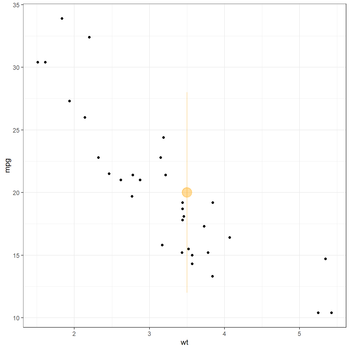
# Left chart: using geom_text
p <- ggplot(mtcars, aes(x = wt, y = mpg)) +
geom_point() + theme_bw()
p + geom_text(data=annotation, aes(x=x, y=y, label=label),
color="orange", size=7 , angle=45, fontface="bold")
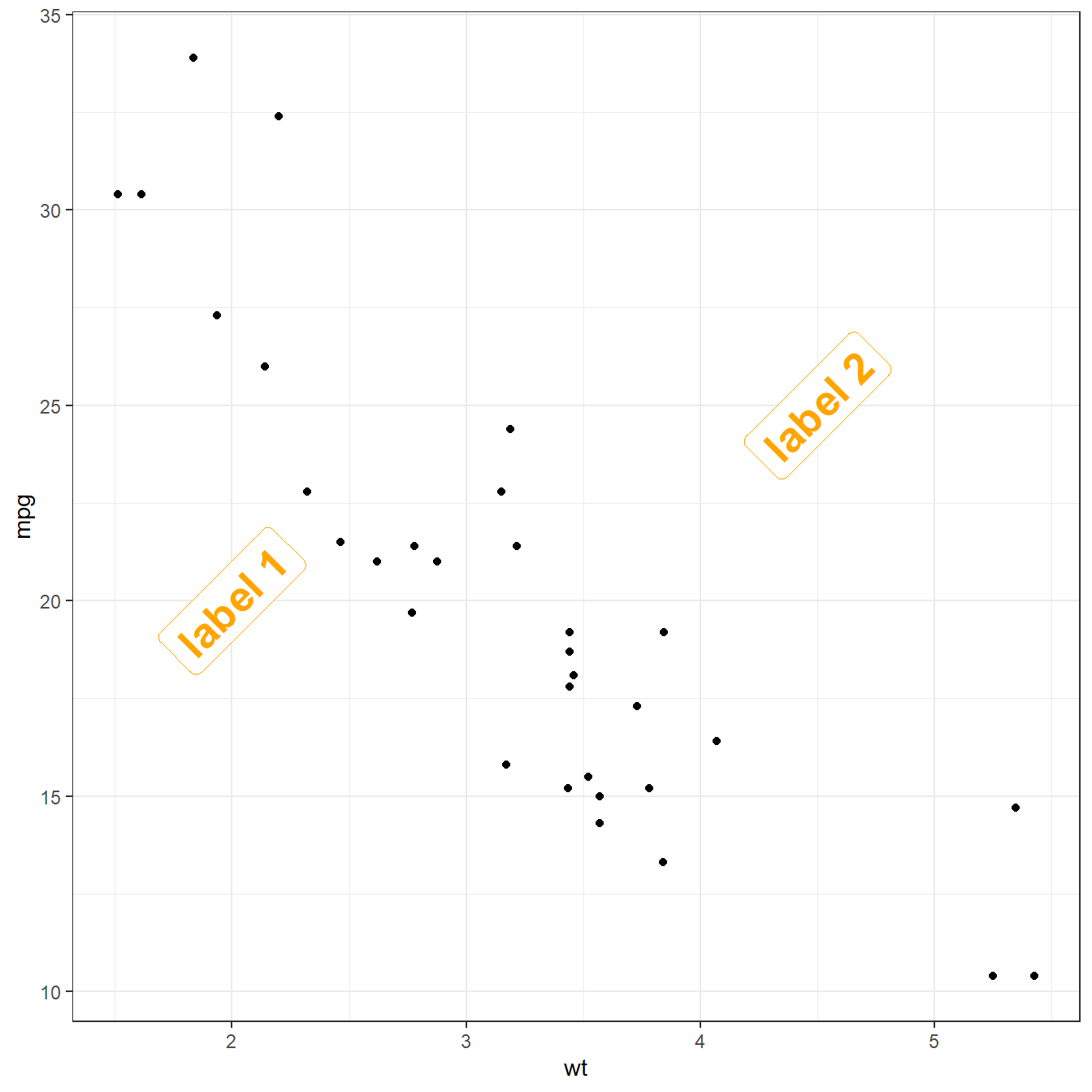
# Middle chart: using geom_label
p + geom_label(data=annotation, aes(x=x, y=y, label=label),
color="orange", size=7 , angle=45, fontface="bold")
# Right chart: using annotate
p + annotate("text", x = c(2,4.5), y = c(20,25),
label = c("label 1", "label 2") , color="orange",
size=7 , angle=45, fontface="bold")

Adding text with geom_text() or
geom_label()
This example demonstrates how to use geom_text() to add
text as markers. It works pretty much the same as
geom_point(), but add text instead of circles. A few
arguments must be provided:
label: what text you want to displaynudge_xandnudge_y: shifts the text along X and Y axischeck_overlaptries to avoid text overlap. Note that a package calledggrepelextends this concept further
# Libraries
library(ggplot2)
library(dplyr)
library(tibble)

# Keep 30 first rows in the mtcars natively available dataset
data <- head(mtcars, 30)

# Add text with geom_text, use nudge to nudge the text
ggplot(data, aes(x=wt, y=mpg)) +
  geom_point() + # Show dots
  geom_text(
    label=rownames(data),
    nudge_x = 0.25, nudge_y = 0.25,
    check_overlap = T) + theme_bw()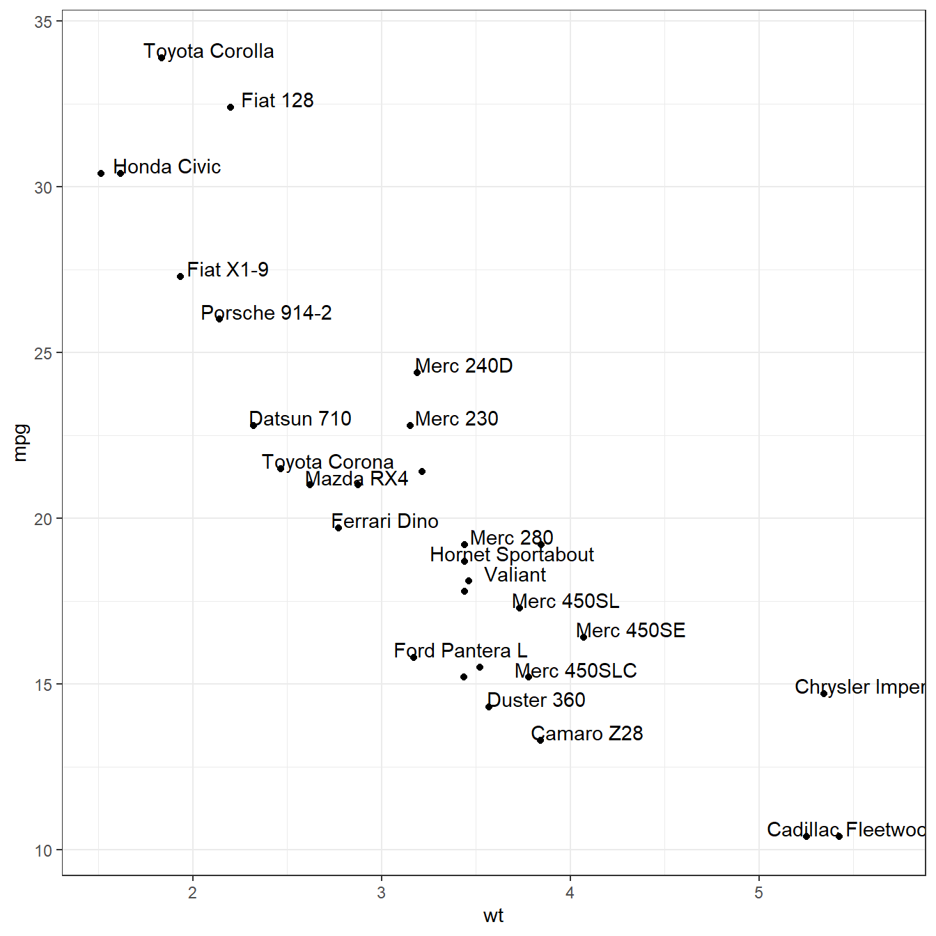
geom_label() works pretty much the same way as
geom_text(). However, text is wrapped in a rectangle that
you can customize.
# Add text with geom_label, use nudge to nudge the text
ggplot(data, aes(x=wt, y=mpg)) +
  geom_point() + # Show dots
  geom_label(
    label=rownames(data),
    nudge_x = 0.25, nudge_y = 0.25,
    check_overlap = T,
    label.padding = unit(0.2, "lines"), # Rectangle size around label
    label.size = 0.05, color = "black",
    fill="#69b3a2") + theme_bw()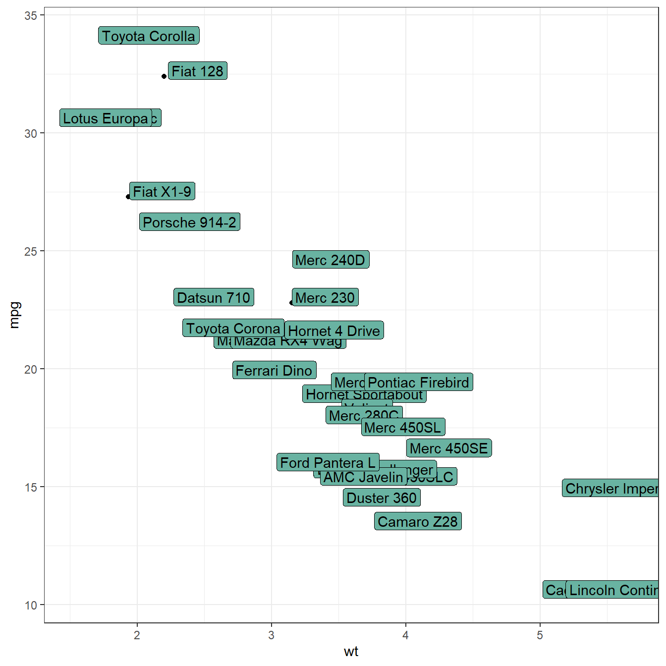
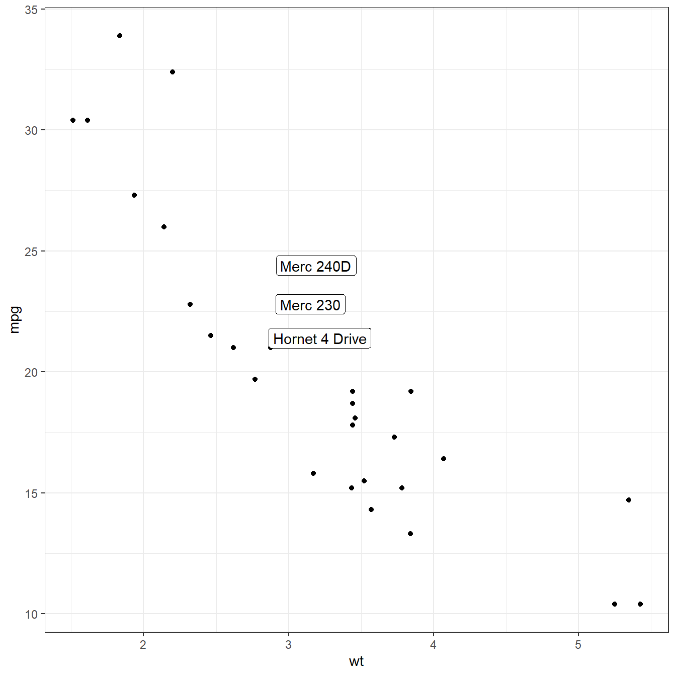
You can also select a group of marker and annotate them only. Here,
only car with mpg > 20 and wt > 3 are
annotated thanks to a data filtering in the geom_label()
call.
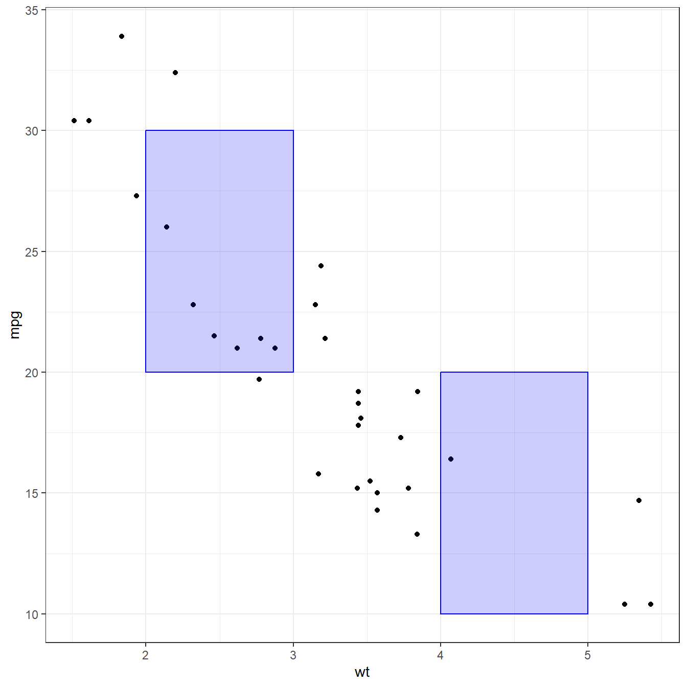
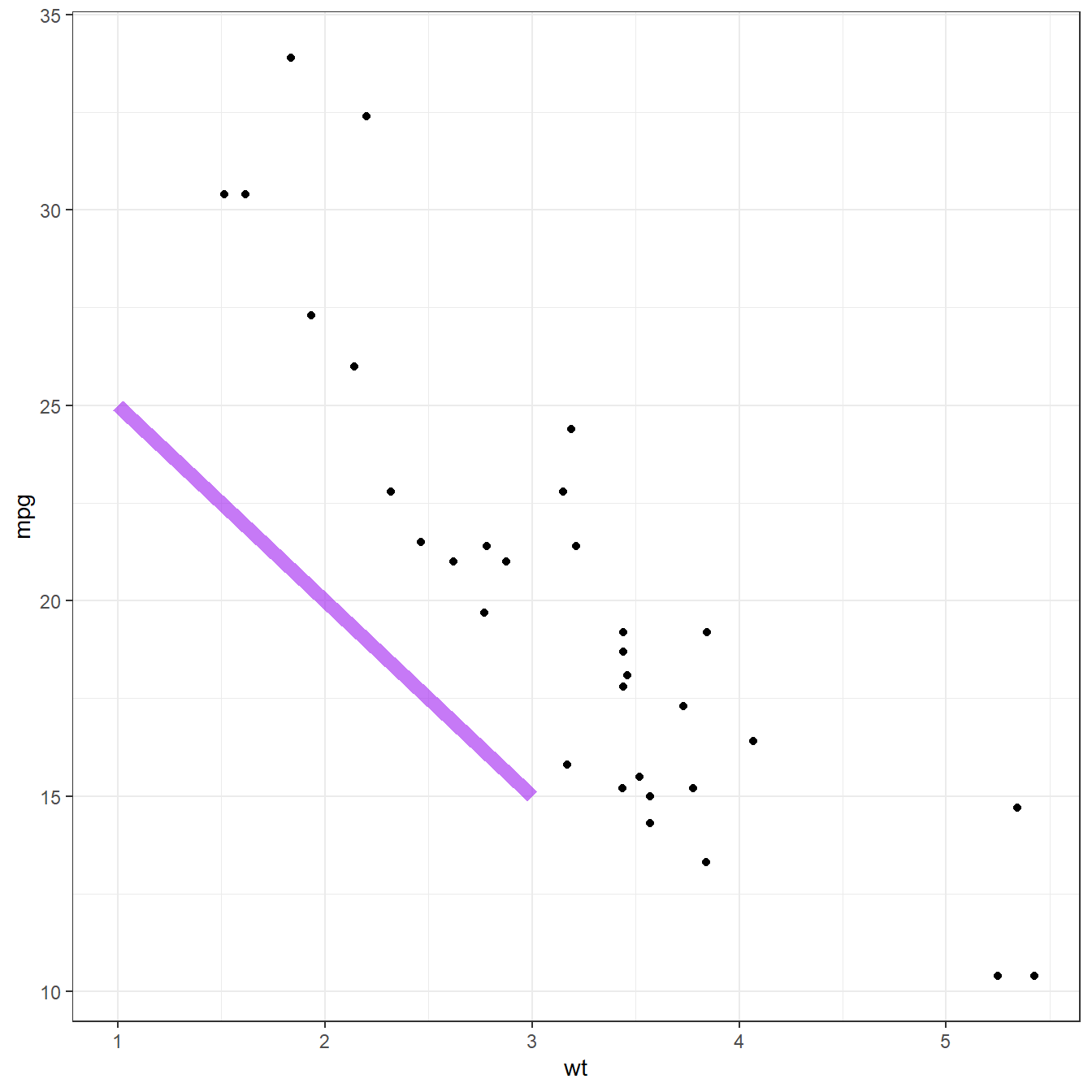
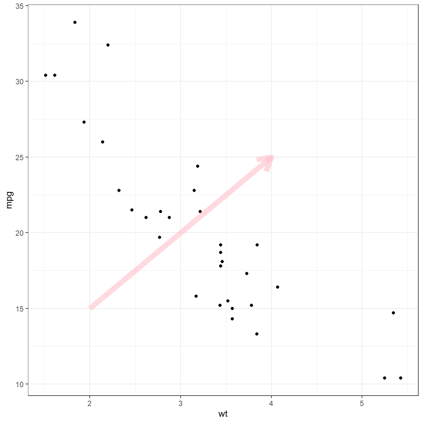
Adding shapes with annotate()
The annotate() function allows to add all kind of shape
on a ggplot2 chart. The first argument will control what
kind is used: rect, segment or
arrow for rectangle, segment or arrow.
# Add rectangles
p + annotate("rect", xmin=c(2,4), xmax=c(3,5), ymin=c(20,10) , ymax=c(30,20), alpha=0.2, color="blue", fill="blue")

# Add segments
p + annotate("segment", x = 1, xend = 3, y = 25, yend = 15, colour = "purple", size=3, alpha=0.6)

# Add arrow
p + annotate("segment", x = 2, xend = 4, y = 15, yend = 25, colour = "pink", size=3, alpha=0.6, arrow=arrow())